

Table of Contents
- 1. Introduction
- 2. Understanding Cinematic Universes in TV Series
- 3. How to Study a TV Series Before Writing Prompts
- 4. Visual Identity: Color, Light, and Atmosphere Across Genres
- 5. Worldbuilding Through Environments
- 6. Texture, Era, and Materiality: The Physical Feel of a Cinematic Universe
- 7. How Different Series Build Their Worlds (Comparative Analysis)
- 8. Vocabulary Foundations: The Words That Define Each Series
- 9. Series Index and Internal Redirections
- 10. Common Mistakes When Recreating TV Series Universes
- 11. How to Describe Characters Without Naming Them
- 12. Conclusion — Final Guidance for AI Artists
Introduction
A TV series is more than a story. It is a visual universe built from deliberate choices in color, lighting, framing, wardrobe, production design and atmosphere. These choices repeat across episodes, creating a coherent identity that viewers recognize instantly. When you recreate a series with AI, you are not recreating a scene. You are recreating a system. You are rebuilding the visual logic that makes the world feel consistent.
Modern television treats visual identity as a storytelling tool. Before dialogue appears, the universe is already speaking through palette, texture, rhythm and space. Some worlds feel dry and exposed. Others feel humid and heavy. Some rely on industrial grit. Others rely on suburban geometry or retro futurism. These patterns define the universe more than the plot ever will, and they are the foundation of cinematic prompting.
To recreate a universe accurately, you must learn to study it. You pause frames, observe color, read lighting, examine textures, identify recurring environments and understand how characters occupy space. You separate narrative from aesthetics. You look at how the show handles daylight, how it treats darkness, how it frames faces, how it builds tension visually. These observations become vocabulary. Vocabulary becomes prompts. Prompts become worlds.
This pillar article exists to map that process. It explains how to analyze a series with intention, how to identify its visual identity, how to understand its environments, how to read posture and movement, how to interpret texture and era, and how to translate all of this into prompts that feel authentic. It also connects you to detailed breakdowns of individual series, allowing you to explore each universe with depth and accuracy.
The goal is not imitation. The goal is coherence. When you understand how a universe is built, you can create new scenes that belong to that world without copying anything directly. You gain control over atmosphere, color, space, materials and character presence. You stop guessing and start designing. By the end of this guide, you will know how to approach any TV series with a structured, analytical mindset and write prompts that capture the world instead of just the moment.
Understanding Cinematic Universes in TV Series
A cinematic universe in television is more than a setting. It is a complete visual identity built through consistent choices in color, lighting, framing, wardrobe, production design, and atmosphere. When a series commits to a unified aesthetic, every scene feels like a piece of the same world, even when the story shifts locations or characters. This consistency is what allows viewers to recognize a universe instantly, and it is the foundation AI artists need before attempting to recreate it.
Modern television treats visual identity as a core storytelling tool. Prestige series rely on deliberate cinematography, controlled palettes, and carefully shaped environments to communicate tone long before dialogue enters the frame. A universe becomes recognizable because it repeats patterns of mood, texture, and rhythm across episodes. This is why prompts built without understanding these patterns often feel generic. They capture isolated details but miss the underlying logic that defines the world.
For AI artists, thinking in terms of universes changes the entire approach to prompting. Instead of describing a single moment, you begin to describe a system. You look at how the show handles darkness, how it treats daylight, how it frames faces, how it uses space, and how it builds tension visually. These elements form a vocabulary that can be translated into prompts with clarity and precision. When you understand the universe, you stop guessing and start designing.
A cinematic universe also creates boundaries. It tells you what belongs and what does not. Some series rely on controlled symmetry, others embrace chaos. Some build worlds through heavy texture, others through clean surfaces. Some use warm palettes to soften violence, others use cold palettes to amplify it. These choices are intentional, and they define the rules you must respect when recreating the universe with AI.
This pillar article exists to map those rules. It explains how to study a series, how to identify its visual identity, how to understand its environments, and how to translate those observations into prompts that feel authentic. It also connects you to detailed breakdowns of individual series, allowing you to explore each universe with depth and accuracy. By the end, you will know how to approach any TV series with a structured, analytical mindset and build prompts that reflect the world rather than just the scene.
How to Study a TV Series Before Writing Prompts
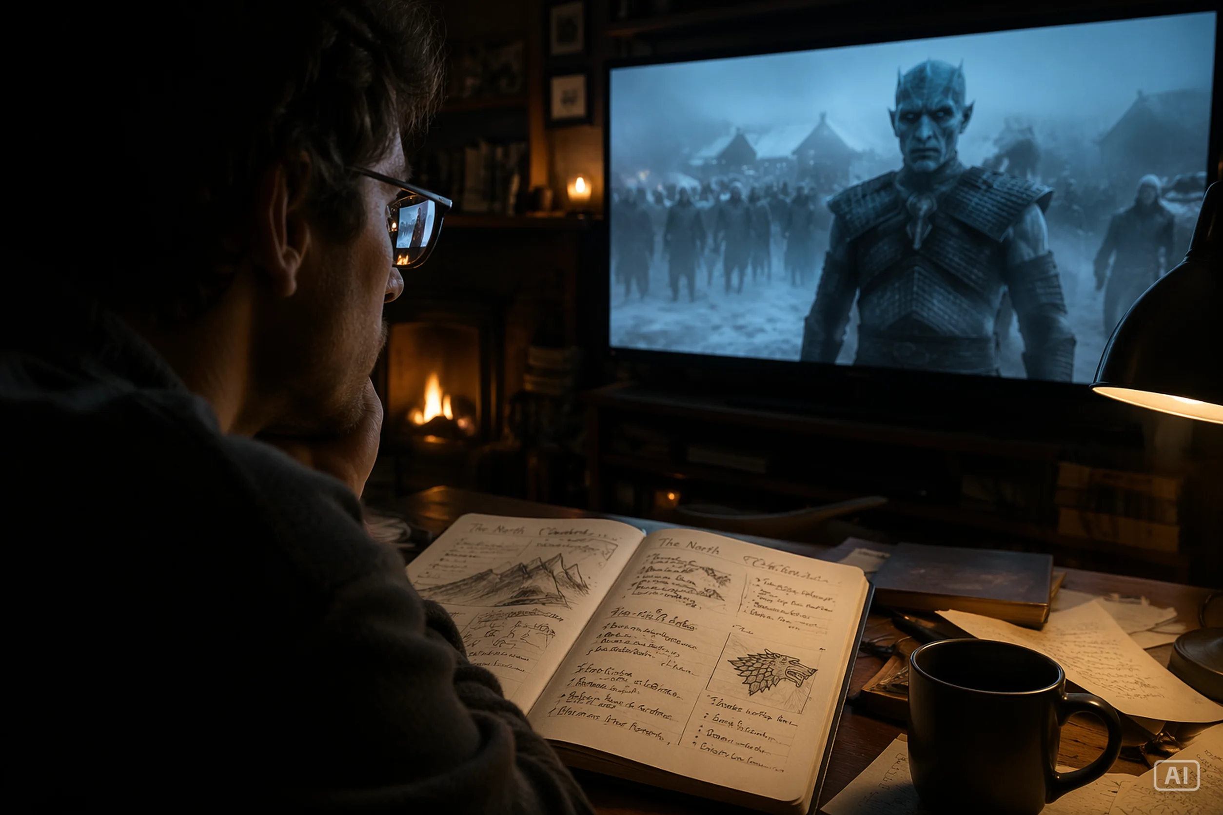
The first rule is the most obvious and the most enjoyable: you actually need to watch the series. Not casually, not while multitasking, but with the kind of attention you’d use if you were trying to understand why the show looks the way it does. It’s the fun part of the process, and it’s where you start seeing the universe instead of just the plot.
A good exercise is to pause the episode and study the frame. Treat it like a still photograph. This exercise won’t help you analyze camera movement — that part only reveals itself when the scene is in motion — but it will sharpen your analytical eye. Once this skill becomes natural, you’ll start noticing details even without pausing. When you pause scenes from the series you’re studying, ask yourself:
• What do I see in this shot?
• How would I describe this shot if I had to?
• What colors define the frame?
• What kind of light shapes the scene?
• What textures stand out in the environment?
• How are the characters positioned within the space?
• What mood does this composition create?
This habit changes the way you watch. You stop reacting to the story and start reading the image. You notice the palette, the direction of the light, the texture of the environment, the way characters are arranged, and the emotional weight carried by the composition. One paused frame can reveal more about the universe than several minutes of continuous viewing.
Studying a series for prompting means observing visuals with intention. You look at how scenes are constructed, how the camera moves, how shadows behave, and how environments shape emotion. You pay attention to the decisions that repeat across episodes, because repetition is what creates identity. When you understand those patterns, you understand the universe.
Each episode becomes a source of visual data. Identify the dominant palette, the lighting style in interiors and exteriors, the rhythm of the camera, and the way characters occupy space. Notice how the show handles tension, silence, and movement. These elements form the backbone of the world. They are not random choices; they are part of the visual logic that defines the series.
Taking notes helps you turn observation into usable material. Short lists work better than long descriptions. Write down recurring textures, lighting setups, wardrobe tendencies, and environmental cues. These notes become the vocabulary you will later translate into prompts. They keep your work grounded in what the series actually uses instead of vague impressions.
It’s important to separate narrative from aesthetics. The plot tells you what happens. The visuals tell you how the world feels. When you study a series for prompting, you focus on the second part. You look at how the show communicates tone without dialogue, how color shifts during emotional beats, and how framing changes during conflict. These choices define the universe more than the storyline ever will.
Understanding intention is part of the process. Every series has a visual purpose. Some aim for realism, others for stylization. Some embrace symmetry, others rely on chaos. When you identify the intention behind the visuals, you understand why certain choices repeat. That intention becomes a guide for your prompts and helps you stay within the boundaries of the universe.
Finally, studying a series teaches you what doesn’t belong. Every universe has limits. When you notice elements that break the style, you learn what to avoid in your prompts. These boundaries are as important as the visual rules themselves. They keep your work coherent and prevent you from mixing aesthetics that don’t fit together.
Watching with intention, pausing frames, observing patterns, taking structured notes, separating story from visuals, and identifying the show’s purpose — this is how you prepare yourself to recreate a TV series universe with accuracy and confidence.
Visual Identity: Color, Light, and Atmosphere Across Genres
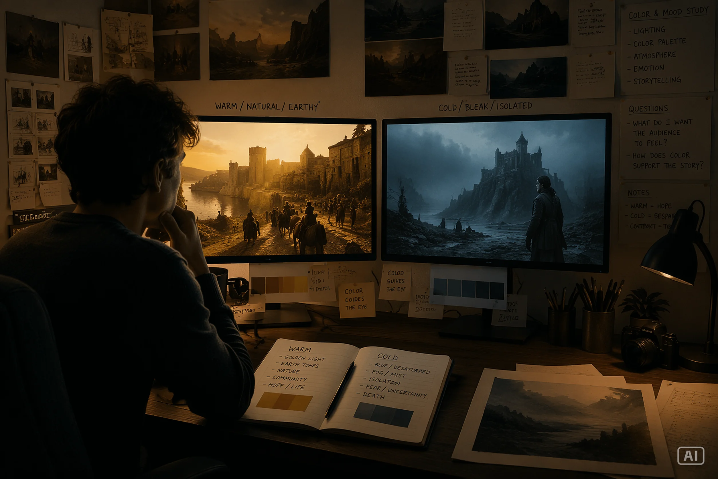
Visual identity in a TV series begins with how the world feels, and that feeling is shaped by three elements: color, light, and atmosphere. These elements don’t exist in isolation — they work together to define the emotional temperature of the universe. Before you think about characters or plot, the series is already telling you what kind of world you’re entering through its visual tone. When you learn to read these cues, you start to understand the identity of the show at a structural level, and that understanding is what allows you to recreate its universe with precision.
Color is the emotional architecture of a series. A cold palette pushes the viewer toward tension, isolation, or dread. A warm palette softens the world, even when the story is violent. Neutral palettes create realism, while saturated palettes push the universe toward stylization. You can often identify a series by its colors alone. Some shows commit to a narrow range, others shift palettes strategically depending on mood. Either way, color is never accidental. It’s a deliberate choice that shapes how the world feels.
Lighting is the narrative guide. It tells you how the series wants you to read each moment. Hard light creates sharp tension. Soft light creates intimacy. Diffused light builds calm. High contrast amplifies conflict. Low contrast smooths the world. Natural light grounds the universe in realism, while artificial light pushes it toward genre stylization. When you study lighting, you’re studying intention. You’re learning how the show communicates emotion without dialogue.
Atmosphere is the glue that holds everything together. It’s the density of the air, the presence of fog or dust, the humidity of interiors, the clarity of daylight, the weight of shadows, and the depth of space. Atmosphere defines whether a world feels clean, gritty, sterile, humid, dry, or oppressive. It’s the invisible layer that makes a universe coherent. Without atmosphere, color and light feel disconnected. With atmosphere, they become a single language.
Genre plays a major role in shaping these choices. Each genre carries its own visual logic:
• Horror — cold palettes, minimal lighting, heavy shadows, dense air.
• Drama — balanced palettes, soft light, naturalistic atmosphere.
• Crime — desaturated colors, harsh contrast, deep shadows, urban grit.
• Fantasy — rich palettes, directional light, stylized atmosphere.
• Sci Fi — neon accents, reflective surfaces, controlled artificial lighting.
• Post apocalyptic — muted palettes, diffused daylight, dusty air, environmental decay.
• Period pieces — warm interiors, era specific palettes, natural light.
• Mystery / Noir — monochromatic tendencies, strong chiaroscuro, narrow beams of light.
• Adventure — warm palettes, open light, clear atmosphere.
• Supernatural — mood driven color shifts, unpredictable lighting, surreal atmospheric cues.
• Comedy — bright palettes, even lighting, clean air.
• Thriller — controlled palettes, strategic lighting, selective darkness.
Identifying a series’ visual identity doesn’t require watching an entire season. Three random frames can reveal the palette, the lighting tendencies, and the atmospheric logic. Look at how the show treats interiors versus exteriors. Notice how the lighting changes between calm scenes and tense ones. Observe how color shifts during emotional beats. These small observations reveal the rules of the universe.
Color and light also define boundaries. They tell you what belongs and what breaks the style. When you understand these boundaries, you avoid mixing aesthetics that don’t fit together. You stay inside the universe instead of drifting into something generic.
Visual identity is the backbone of any cinematic universe. Once you learn how to read color, light, and atmosphere, you can understand any series at a structural level — and you can recreate its world with accuracy.
Worldbuilding Through Environments
Environments are the physical stage of a TV universe. They don’t replace color, lighting, or atmosphere — they give those elements a place to exist. Streets, interiors, landscapes, and architecture shape how the world feels and how the story breathes. When you understand the environments, you understand the structure that supports the entire visual identity.
Geography is one of the strongest visual anchors. A desert creates a sense of exposure and vulnerability. A dense forest creates mystery and claustrophobia. A coastal town feels open and melancholic. A crowded city feels tense and restless. Geography shapes the emotional logic of the universe, and it dictates how scenes breathe. When you study a series, you’re not just looking at where characters stand. You’re looking at the world that surrounds them and how that world influences the tone.
Climate is another layer of worldbuilding. Rain adds weight. Snow slows everything down. Humidity makes interiors feel heavy. Dust creates decay. Wind adds movement to otherwise static scenes. Climate is not decoration; it’s a storytelling tool. It changes how environments behave and how characters interact with space. When you analyze climate, you’re analyzing the emotional texture of the world.
Architecture defines identity. Modern buildings create clean, structured universes. Old houses create warmth or nostalgia. Industrial structures create grit. Rural spaces create isolation. Architecture tells you what kind of world the characters inhabit and what kind of stories that world supports. It also sets boundaries. A universe built on industrial decay doesn’t suddenly shift to polished modern interiors without breaking its own logic.
Interiors and exteriors behave differently. Interiors reveal intimacy, control, and detail. Exteriors reveal scale, openness, and unpredictability. Some series rely heavily on interiors to create tension. Others use exteriors to build freedom or danger. When you study environments, you need to understand how the show balances these two spaces and what each one contributes to the universe.
Recurring environments are the visual symbols of a series. A bar, a cabin, a police station, a bunker, a street corner — these places become part of the identity. They appear repeatedly, not because the story demands it, but because they anchor the viewer to the world. When you identify these recurring spaces, you identify the core of the universe.
Analyzing environments for prompting requires attention to structure. Look at the shapes that dominate the world. Notice how objects are arranged. Observe how the environment reacts to climate. Identify what belongs and what doesn’t. When you understand the environment, you stop describing random locations and start describing the world as the series defines it.
Worldbuilding begins with space. Once you learn how to read environments — geography, climate, architecture, interiors, exteriors, and recurring locations — you gain the ability to recreate any TV universe with accuracy and confidence.
Character Presence: How People Shape a Cinematic Universe
Characters define the human dimension of a TV universe. Not through dialogue or personality, but through presence — posture, movement, silhouette, wardrobe, and the way they occupy space. When you study characters visually, you start to understand how a series communicates identity through the people who inhabit its world.
Presence begins with posture. Some characters stand with controlled tension, others carry weight in their shoulders, others move with confidence or hesitation. Posture is a visual signature. It tells you how a character exists inside the universe. A rigid stance creates pressure. A relaxed posture creates openness. A defensive posture creates unease. When you analyze posture, you’re reading the physical language of the world.
Movement is another layer of identity. Slow, deliberate steps create gravity. Quick, restless gestures create instability. Heavy movement communicates exhaustion. Precise movement communicates discipline. Rhythm is part of the universe. A character who moves like they’re carrying history creates a different tone than one who moves like they’re ready to act. Movement is not choreography — it’s atmosphere expressed through the body.
Wardrobe is an extension of the world. Fabrics, cuts, layers, damage, functionality — everything contributes to the visual logic of the universe. A worn jacket tells a story of survival. A clean suit tells a story of control. Heavy fabrics create weight. Loose fabrics create motion. Minimalist clothing creates clarity. Wardrobe is not fashion; it’s worldbuilding stitched into the character.
Silhouette is recognition. A character’s outline — the shape of their coat, the curve of their shoulders, the way their hair frames the head — becomes part of the universe. Silhouettes allow you to identify characters even in low light or from a distance. They are visual anchors. When you understand silhouettes, you understand how the series builds identity through form.
Characters also interact with environments in meaningful ways. Some dominate space. Others disappear into it. Some move through interiors with caution. Others cut through exteriors with confidence. The relationship between character and environment defines tone. A character who looks small in a large landscape communicates vulnerability. A character who fills a narrow corridor communicates pressure. Studying this relationship reveals how the universe treats its inhabitants.
To analyze characters for prompting, you need to observe patterns. Look at how posture repeats. Notice gestures that appear often. Identify how wardrobe reacts to movement and light. Observe how characters alter the composition of a scene. When you understand these elements, you can describe characters visually instead of narratively — and that’s the foundation of cinematic prompting.
Useful Vocabulary for Describing Characters Visually
• Posture: upright, tense, slouched, rigid, relaxed, defensive, grounded
• Movement: deliberate, heavy, restless, fluid, cautious, abrupt, controlled
• Silhouette: broad shouldered, narrow frame, layered outline, angular, compact
• Wardrobe: weathered fabric, layered clothing, tailored coat, worn leather, utilitarian gear
• Presence: imposing, subtle, restrained, volatile, composed, weary
• Interaction with space: dominates the frame, blends into the environment, moves through shadows, occupies negative space
Practical prompt examples:
Prompt 1
Posture & Presence A lone figure standing with a tense, upright posture, shoulders slightly raised, presence heavy and controlled, silhouette defined by a long worn coat, framed inside a narrow corridor that amplifies pressure.
Prompt 2
Movement & Rhythm A character walking with slow, deliberate steps, weight visible in each movement, coat shifting with every motion, hands steady, expression grounded, captured mid stride in a dim interior.
Prompt 3
Silhouette & Wardrobe A broad shouldered silhouette outlined against a muted background, layered clothing creating depth, worn leather jacket with visible texture, stance firm, presence calm but imposing.
Prompt 4
Interaction with Environment A small figure crossing an open landscape, posture slightly slouched, movement cautious, clothing reacting to wind, environment dwarfing the character to emphasize vulnerability.
Texture, Era, and Materiality: The Physical Feel of a Cinematic Universe
The physical world of a TV series is defined by what things are made of, how they age, and which era they belong to. Texture, materiality, and historical context shape the tactile identity of a universe. They determine whether the world feels lived in, sterile, modern, ancient, industrial, rural, or futuristic. When you understand these elements, you understand the physical logic of the series.
Texture is the first layer of material identity. Rough surfaces create tension. Smooth surfaces create calm. Worn textures create history. Polished textures create precision. Organic textures create warmth. Synthetic textures create distance. Texture is not decoration; it is a visual signal that tells you how the world should feel. When you study texture, you are reading the tactile language of the universe.
Materiality defines the structure of the world. Wood, metal, stone, fabric, glass, plastic — each material carries its own aesthetic weight. A world built on metal feels cold and industrial. A world built on wood feels warm and grounded. A world built on stone feels ancient and heavy. A world built on plastic feels modern and manufactured. Materials reveal the universe’s priorities and limitations.
Era is one of the most important elements for maintaining coherence. It prevents generative conflicts and eliminates anachronisms. Every period has its own materials, objects, technologies, manufacturing styles, architectural details, and surface treatments. When the era is ignored, the universe breaks immediately. A modern hinge in a medieval door, a synthetic fabric in a 1950s wardrobe, a contemporary plastic chair in a 1980s living room — these small mistakes destroy authenticity. Era is not about history; it is about visual consistency.
Objects reveal the era more clearly than anything else. Tools, weapons, vehicles, appliances, furniture — each one carries the design logic of its time. Rounded edges, sharp angles, visible screws, hidden mechanisms, analog dials, digital displays — these details define the period. When you analyze objects, you are analyzing the timeline of the universe.
Wear tells you how long the world has existed. Scratches, rust, chipped paint, frayed fabric, worn leather, faded wood — each type of wear belongs to a specific material and a specific era. Modern plastics age differently from old metals. Vintage fabrics degrade differently from contemporary synthetics. Wear is a visual record of time, and time is part of the universe.
Surfaces complete the physical identity. Matte surfaces create realism. Glossy surfaces create modernity. Dirty surfaces create weight. Clean surfaces create clarity. Reflective surfaces create tension. Absorbent surfaces create softness. When you understand surfaces, you understand how the world interacts with light and how it communicates tone.
To analyze texture and materiality for prompting, you need to observe how materials repeat, how objects age, how surfaces behave, and how era shapes everything. When you understand these elements, you can describe the physical world with accuracy instead of guessing, and that is what prevents incoherence.
Useful vocabulary for describing texture and materiality
• Texture: rough, coarse, grainy, polished, worn, frayed, cracked, weathered
• Materials: aged wood, cold metal, rough stone, torn fabric, oxidized steel, brittle plastic
• Era cues: analog machinery, vintage upholstery, handcrafted surfaces, pre digital tools
• Wear: rusted edges, faded paint, chipped stone, frayed seams, worn leather
• Surfaces: matte finish, glossy sheen, dusty layer, reflective metal, textured grain
• Objects: retro appliances, industrial tools, period furniture, handcrafted items
Practical prompt examples
Prompt 1
Texture and materiality A room built from aged wood and cold metal, surfaces worn and grainy, fabric frayed at the edges, objects showing decades of use, atmosphere grounded in tactile realism.
Prompt 2
Era and object identity A 1970s workshop filled with analog tools, chipped paint on metal cabinets, vintage machinery with visible screws, matte surfaces absorbing light, materials consistent with the era.
Prompt 3
Wear and surface logic A weathered stone corridor with cracked surfaces, rusted metal fixtures, faded markings on the walls, texture heavy and tactile, every object showing the imprint of time.
Prompt 4
Material coherence A medieval interior built from rough stone and untreated wood, fabrics coarse and hand woven, no modern materials present, surfaces matte and irregular, era preserved without conflict.
How Different Series Build Their Worlds (Comparative Analysis)
Every TV universe is built through a combination of color, light, space, camera movement, atmosphere and material identity. These elements define how a world feels and how it communicates tension, danger or decay. When you compare series through their visual construction, you understand why each universe is unique and why mixing incompatible styles in prompts often leads to incoherent results.
This chapter examines pairs of series that allow meaningful visual comparison. Each pair shares a broad thematic direction, but expresses it through different cinematic choices. The goal is to understand how these worlds are built and how their differences translate into prompt design.
Breaking Bad vs True Detective
Crime worlds built from opposite visual philosophies
Breaking Bad and True Detective both explore moral collapse, but their visual strategies diverge sharply. Breaking Bad leans on open space, strong sunlight and a warm desert palette. True Detective leans on muted color, heavier atmosphere and enclosed rural environments. These differences are visible on screen and shape how each world communicates tension.
Breaking Bad — visual traits
• Setting and space: frequent wide shots that reveal the New Mexico desert and open surroundings.
• Color: warm tones linked to the desert setting, with browns, yellows and sandy palettes.
• Lighting: strong natural light in many exterior scenes, with hard shadows and high contrast.
• Camera: controlled and deliberate movement, with stylized sequences that underline tension.
True Detective — visual traits
• Setting and space: rural and small town environments, often visually irregular or cluttered.
• Color: muted, desaturated tones that support a somber mood.
• Lighting: diffused daylight and dim interiors that feel natural rather than polished.
• Camera: slow, measured movement, sometimes handheld, reinforcing introspection.
Core difference
Breaking Bad builds its world around open desert space, strong sunlight and warm tones. True Detective builds its world around muted color, heavier atmosphere and enclosed rural environments.
Narcos vs Sons of Anarchy
Criminal worlds shaped by different eras, cultures and materials
Narcos and Sons of Anarchy both revolve around crime, but their visual identities come from different cultural contexts. Narcos draws from Colombian urban and rural environments, with tropical density and political tension. Sons of Anarchy is rooted in American biker culture, shaped by industrial decay and suburban grit. Their worlds feel different because they are built from different materials, climates and social spaces.
Narcos — visual traits
• Setting: Colombian cities, rural zones and official interiors.
• Color: warm tones and natural greens that reflect tropical and urban environments.
• Lighting: strong daylight outdoors, interiors with natural or practical light.
• Camera: dynamic movement that follows action and tension.
Sons of Anarchy — visual traits
• Setting: small towns, industrial zones and open roads.
• Color: neutral and earthy tones, often low in saturation.
• Lighting: dry daylight and simple interiors with functional lighting.
• Camera: heavier, more grounded movement that emphasizes physical presence.
Core difference
Narcos is warm, tropical and historically influenced. Sons of Anarchy is dry, industrial and shaped by biker culture.
The Walking Dead vs Fallout
Two apocalyptic worlds built from different eras and material cultures
The Walking Dead and Fallout both depict collapse, but through different cinematic languages. The Walking Dead builds an apocalyptic world from organic decay, rural environments and improvised shelters. Fallout builds its world from technological ruin, radioactive debris and retro futuristic design. Their differences come from era, materials and atmosphere.
The Walking Dead — visual traits
• Setting: rural areas, forests, roads and small communities.
• Color: neutral earth tones, grays and washed out greens.
• Lighting: natural daylight, overcast skies and simple interior lighting.
• Camera: slow, observant movement that reinforces caution and survival.
Fallout — visual traits
• Setting: post nuclear ruins, damaged urban areas and retro futuristic interiors.
• Color: cold tones, greens associated with radiation, and retro saturated accents.
• Lighting: artificial sources, neon signs and contrasts created by damaged technology.
• Camera: chaotic or irregular movement that reflects instability and ruin.
Core difference
The Walking Dead constructs an organic, rural apocalypse built from improvisation. Fallout constructs a technological, urban apocalypse built from nuclear ruin and retro futurism.
Why these comparisons matter for prompting
Understanding how color, light, space, movement, atmosphere and materials differ between worlds prevents you from mixing incompatible elements. It keeps prompts coherent and avoids generative conflicts. When you know how each universe is built, you can recreate it with precision instead of guesswork.
Vocabulary Foundations: The Words That Define Each Series
Each series builds its world through recurring visual cues. Certain words naturally attach themselves to these worlds because they describe their environments, atmosphere, color, materials and movement. This chapter gathers a comparative vocabulary set for key series, so you can see how their identities differ at a glance and use the right terms when building prompts.
The table below does not try to be exhaustive. It focuses on practical descriptive vocabulary that fits how these universes look and feel on screen.
| Series | Environment keywords | Atmosphere keywords | Color and light keywords | Movement and presence keywords |
|---|---|---|---|---|
| Vikings | desert outskirts, motels, suburban houses | dry, exposed, harsh | warm, sun bleached, high contrast | controlled, deliberate, brittle tension |
| The Walking Dead | rural roads, forests, improvised shelters | dirty, tense, stagnant | muted, desaturated, dusty daylight | cautious, exhausted, survival focused |
| Breaking Bad | desert outskirts, motels, suburban houses | dry, exposed, harsh | warm, sun bleached, high contrast | controlled, deliberate, brittle tension |
| True Detective | rural backroads, small towns, cluttered interiors | humid, oppressive, somber | muted, low saturation, soft daylight | muted, low saturation, soft daylight slow, introspective, burdened |
| Fallout | ruined cities, bunkers, retro tech interiors | radioactive, unstable, eerie | cold, neon, retro saturated accents | chaotic, erratic, unstable |
| Stranger Things | suburbs, school corridors, basements | electric, uncanny, charged | cool, saturated, fluorescent, dim interiors | restless, nervous, youthful |
| Peaky Blinders | industrial streets, factories, smoky bars | smoky, dense, gritty | low key, warm interiors, foggy exteriors | sharp, calculated, imposing |
| Narcos | urban districts, government offices, rural compounds | warm, dense, volatile | tropical, sunlit, saturated greens and browns | fast, direct, pressured |
| Sons of Anarchy | garages, highways, small town streets | dry, dusty, rough | neutral, faded, hard daylight | heavy, grounded, confrontational |
• Environment keywords capture where the series usually places its characters and how those spaces feel structurally.
• Atmosphere keywords describe the weight of the air, the emotional temperature and the general sense of presence.
• Color and light keywords point to the dominant visual impression rather than strict technical values.
• Movement and presence keywords reflect how characters and scenes tend to behave physically.
This vocabulary is meant to be used directly in prompts. Instead of writing vague descriptions, you can anchor your scenes with terms that match the visual identity of each universe. It helps you avoid mixing incompatible atmospheres and keeps your prompts aligned with the world you are trying to evoke.
Series Index and Internal Redirections
Vikings
Explore the visual identity of a world shaped by weather, wood, iron, ritual and physical weight. Read the full Vikings guide → Link here
The Walking Dead
A rural apocalypse built from organic decay, improvised shelters and heavy atmosphere. Read The Walking Dead guide → Link here
Breaking Bad
A dry, exposed world defined by desert horizontality, harsh sunlight and controlled tension. Read the Breaking Bad guide → Link here
True Detective
A somber rural universe built from muted color, humidity, introspective movement and emotional weight. Read the True Detective guide → Link here
Fallout
A post nuclear world shaped by retro futurism, irradiated atmosphere, damaged technology and urban ruin. Read the Fallout guide → Link here
Stranger Things
A suburban universe defined by cool saturation, electric tension, dense interiors and youthful movement. Read the Stranger Things guide → Link here
Peaky Blinders
An industrial world built from smoke, grit, low key interiors and sharp controlled presence. Read the Peaky Blinders guide → Link here
Narcos
A tropical urban world shaped by warm tones, dense humidity, political tension and fast movement. Read the Narcos guide → Link here
Sons of Anarchy
A dry industrial universe defined by biker culture, faded daylight, leather, metal and grounded physicality. Read the Sons of Anarchy guide → Link here
How to use this hub
This chapter is designed to be a navigation anchor. When you want to write prompts for a specific universe, follow the link to its dedicated guide. Each guide expands the vocabulary, spatial logic, atmosphere and material identity of that world, ensuring your prompts stay coherent and visually accurate.
Common Mistakes When Recreating TV Series Universes
Recreating a TV universe requires more than atmosphere and color. It requires temporal accuracy. Every series belongs to a specific era, and that era defines materials, technology, clothing, architecture, lighting and even the rhythm of movement. When era is ignored or misrepresented, the entire prompt collapses.
This chapter highlights the most common mistakes that break cinematic coherence. These errors appear across all series and are responsible for most generative inconsistencies.
Using the wrong era
This is the most damaging mistake. Era defines everything: materials, clothing, tools, vehicles, architecture, lighting sources and cultural behavior. When you place a character or object outside its correct decade, the universe becomes instantly incoherent.
Examples of era breaking mistakes
• modern fabrics inside early twentieth century industrial England
• contemporary vehicles inside tropical Colombia of the eighties
• digital screens inside rural environments built from analog tools
• retro futuristic tech inside grounded crime dramas
• neon lighting inside worlds defined by natural daylight
Series where era is critical
• Peaky Blinders: early twentieth century industrial England. Clothing, materials and lighting must reflect the period.
• Narcos: late seventies to early nineties Colombia. Architecture, vehicles and technology must match the decade.
• Stranger Things: eighties suburban America. Analog devices, fluorescent interiors and period accurate objects are essential.
• Fallout: retro futuristic post nuclear world inspired by mid twentieth century design. Technology must look old, not modern.
• Breaking Bad: contemporary New Mexico. Modern but not futuristic.
• True Detective: contemporary rural America, but grounded and analog in feel.
• Sons of Anarchy: contemporary biker culture with industrial decay.
• The Walking Dead: contemporary collapse with improvised materials.
• Vikings: early medieval Scandinavia. No modern materials, no industrial surfaces.
Era is not optional. It is the backbone of the universe.
Mixing incompatible atmospheres
Atmosphere defines emotional weight. When you combine atmospheres that do not belong together, the world loses identity.
Common mismatches:
• dry desert air inside humid rural worlds
• tropical density inside industrial biker environments
• radioactive stillness inside organic rural collapse
Atmosphere must match the world’s logic.
Using color palettes that contradict the universe
Color is one of the strongest identity markers. When the palette is wrong, the scene feels disconnected.
Typical errors:
• warm desert tones inside cold post nuclear worlds
• neon accents inside rural improvised environments
• saturated tropical greens inside muted crime dramas
Color must reinforce the universe.
Combining materials from different eras or cultures
Materials define time and place. When you mix incompatible materials, the prompt becomes visually confused.
Examples:
• modern plastics inside early historical settings
• retro tech inside grounded contemporary crime dramas
• clean industrial surfaces inside dusty biker environments
Materials must match era and culture.
Ignoring spatial logic
Every universe organizes space differently. When you place characters in the wrong type of environment, the scene loses identity.
Examples:
• narrow corridors inside rural apocalypse worlds
• structured urban blocks inside desert horizontality
• improvised shelters inside suburban geometry
Space determines how the camera sees.
Using movement that contradicts the world’s rhythm
Movement communicates tension. When movement does not match the universe, the scene feels artificial.
Common mismatches:
• fast restless motion inside slow introspective worlds
• heavy grounded movement inside youthful suburban settings
• chaotic motion inside controlled environments
Movement must follow the world’s rhythm.
Overloading prompts with adjectives
Too many adjectives create noise. They dilute identity instead of reinforcing it.
Signs of overload:
• long chains of descriptors
• repeated adjectives
• vague emotional terms
Precision beats quantity.
Borrowing vocabulary from the wrong universe
Each series has its own vocabulary. Borrowing terms from another universe breaks coherence.
Examples:
• industrial grit inside tropical environments
• retro futurism inside rural decay
• suburban geometry inside desert worlds
Vocabulary must match the world’s identity.
Ignoring the role of light
Light defines mood and era. When lighting contradicts the world, the scene loses authenticity.
Common mistakes:
• harsh sunlight inside worlds defined by diffused daylight
• dim interiors inside worlds built from bright artificial light
• fluorescent tones inside natural rural settings
Light is part of the world’s logic.
Why these mistakes matter
A TV universe is a system. When one element breaks, the entire system feels wrong. Avoiding these mistakes keeps your prompts coherent, protects the identity of the world and ensures the model generates images that belong to the universe instead of generic approximations.
How to Describe Characters Without Naming Them
The goal of this guide is to help you recreate the visual identity of a character without using copyrighted names. Some generative engines allow direct references. Others block them. To stay safe across all platforms, you must learn how to describe a character through physical traits, posture, clothing, era and emotional presence instead of relying on names.
This article is about inspiration, not imitation. The objective is to capture the essence of a universe and build new characters that feel like they belong to that world. But if you still want to create a character inspired by a well known figure, you must describe them through observable traits only.
Below you will find safe, accurate descriptions for several iconic characters. Each description avoids names and focuses on physical identity, posture, clothing, era and emotional tone.
How to describe Ragnar Lothbrok
A weathered man from an early medieval northern culture, with pale skin, sharp blue eyes and a lean athletic build. Hair styled in a tight warrior braid with shaved sides, beard short and rugged. Clothing made from rough wool, leather and fur, marked by age and battle. Presence calm, strategic and quietly intense, with a gaze that feels both curious and calculating.
How to describe Bjorn Ironside
A tall and broad northern warrior with strong shoulders, pale skin and a confident stance. Hair short or partially shaved with a light beard, features bold and youthful. Clothing built from leather, fur and metal accents, showing signs of travel and combat. Presence determined, proud and physically imposing, with a direct and fearless gaze.
How to describe Walter White
A middle aged man with a thin frame, pale skin and a tense posture. Early phase: light brown thinning hair, a narrow mustache and large metal frame glasses. Clothing simple and practical, often beige or muted, reflecting an ordinary suburban life. Later phase: shaved head, trimmed beard, colder expression and more controlled presence, with darker clothing that reinforces a calculated and intimidating tone.
How to describe Jax Teller
A young adult with a lean but athletic build, light skin and a restless posture. Hair medium length and blond, often pushed back. Clothing dominated by denim, leather and layered streetwear, including a sleeveless biker vest with patches. Presence conflicted but charismatic, with a mix of calm intensity and sudden emotional weight.
How to describe Pablo Escobar
A middle aged man with a stocky build, medium skin tone and a calm but heavy presence. Hair dark, thick and slightly curled, with a distinctive mustache. Clothing from late twentieth century Colombia, including patterned shirts, neutral trousers and period accurate accessories. Expression steady and contemplative, with a posture that feels grounded and quietly authoritative.
How to describe Rust Cohle
A thin man with a tired posture, pale skin and a withdrawn presence. Hair long and unkempt in earlier years, shorter and more controlled later. Clothing muted and practical, often worn shirts, simple jackets and neutral tones. Expression introspective, distant and analytical, with a gaze that feels heavy and reflective. Movement slow and deliberate, shaped by emotional weight.
How to describe Daryl Dixon
A lean man with a rugged build, tanned skin and a survival focused posture. Hair medium length, dark and messy. Clothing improvised and worn, dominated by denim, leather and dark fabrics. Presence quiet, guarded and alert, with movements shaped by caution and experience. Expression intense but controlled, reflecting resilience and solitude.
Why this method works
Describing characters through physical traits, posture, clothing, era and emotional tone allows you to recreate their identity without violating copyright restrictions. It also gives you more creative freedom. You can build new characters inspired by familiar archetypes while keeping your prompts safe, flexible and visually coherent.
Conclusion — Final Guidance for AI Artists
Recreating a TV universe with AI is not about copying scenes or characters. It is about understanding how a world is built and using that knowledge to create new images that feel authentic. Every series has its own logic. Space, atmosphere, color, materials, movement and era work together to form a visual identity. When you respect that identity, your prompts become coherent and intentional.
The chapters in this guide showed how to analyze worlds, how to compare them, how to choose vocabulary, how to avoid common mistakes and how to describe characters safely without relying on copyrighted names. These skills give you control. They allow you to build prompts that feel cinematic instead of generic.
The most important lesson is simple: AI does not create coherence. You do. The model follows the structure you give it. When your prompt is clear, the world becomes clear. When your vocabulary is precise, the image becomes precise. When your choices match the universe, the result feels like it belongs there.
Use these techniques to explore, experiment and refine your own visual style. Let the series inspire you, but let your prompts define the world.
Try the Cinematic Prompt Builder
Create your own cinematic prompts with our free builder.
Try the ToolContinue Reading
- How to Create AI Prompts in the Style of Peaky BlindersLearn how to create powerful AI prompts inspired by the cinematic style of Peaky
- How to Recreate the Netflix Narcos Visual Universe Using AIExplore how Narcos builds its cinematic identity through light, color, texture,